Hi, I'm Micah.

I'm a data analyst. I turn messy data into numbers people can actually check.

Things I build

the logo is a pie chart I drew with colored pencils. there's still a retro lab hidden behind the footer

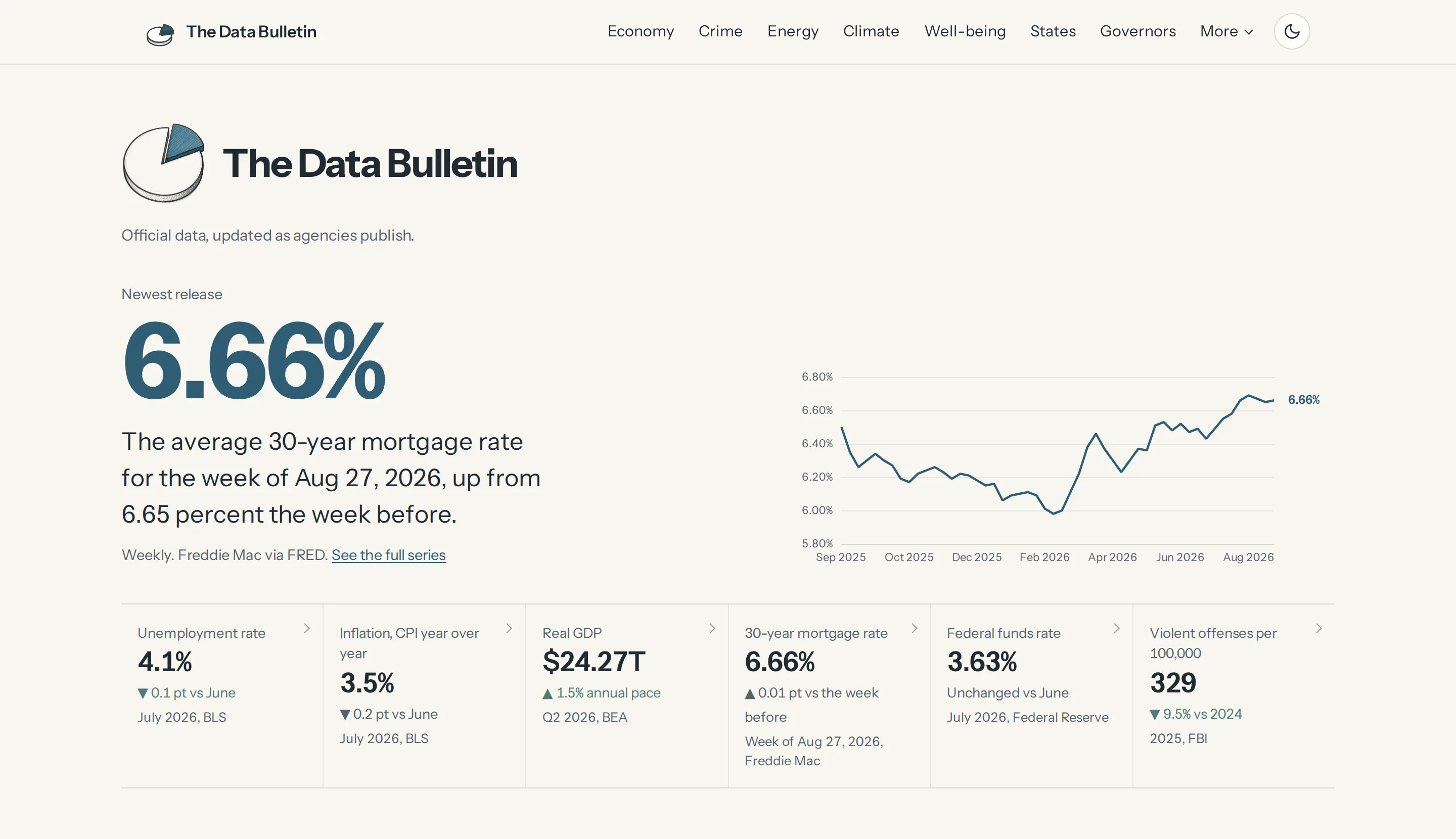
The Data Bulletin live

A live data site that pulls U.S. jobs, prices, growth, housing, energy, crime, climate and well-being figures straight from official sources as the agencies publish them. Every number carries its own period and source, every chart has a data table, and a feed that does not answer says so instead of showing a stale number.

The newest section, The Governors, measures a governor's years in office on the official series, the same way before and after: Oregon's last decade against Tina Kotek's term, on 25 charts, plus all 105 ways people judge a local government.

120+ charts · 11 official sources · 0 scraped pages
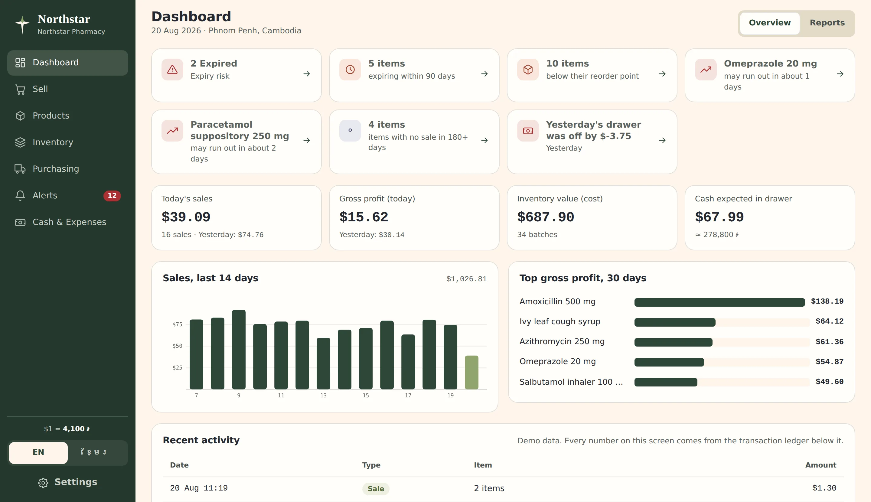
it's a real working demo. go sell some paracetamol

Northstar Pharmaceutical System v0.1

A point-of-sale and pharmacy management system built for a small pharmacy in Phnom Penh. It handles Khmer and English, dollars and riel, and stock by batch and expiry, so every sale pulls from the batch that expires first and records it on the receipt.

The dashboard is where the data analyst in me took over. It brings sales, cash, stock, and upcoming expiries into one clear view, with every number calculated from the same transaction ledger. Nothing edits stock or cash directly. When a figure looks strange, you can trace it back to the transaction that created it instead of arguing with the screen.

7 screens · 2 languages · 2 currencies · 1 ledger behind every number

book a chair, then go run the salon

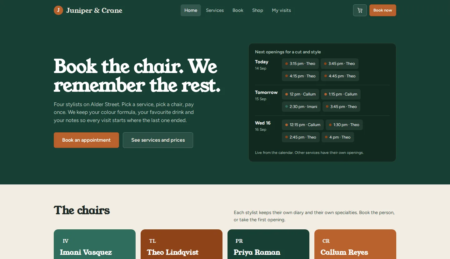
Juniper & Crane demo

An all-in-one booking site for a fictional hair salon. Customers pick a service and a stylist, answer five quick comfort questions (drink, shampoo length, warm towel, snack), and pay up front with a simulated card. Stylists get a day sheet with those answers already on it, a full client record, a text inbox, and a waitlist that fires the moment a slot opens.

The owner's side is the part I cared about most. Every number on the dashboard and the P&L traces back to a booking you can find on the other two sides: the 10% cancellation fee shows up as its own line, refunds are never netted away, and payroll recalculates the moment a stylist checks someone out. The demo data rebuilds itself around today's date, so it never goes stale.

3 sides · 4 stylists · 80 clients · 1 store behind every number

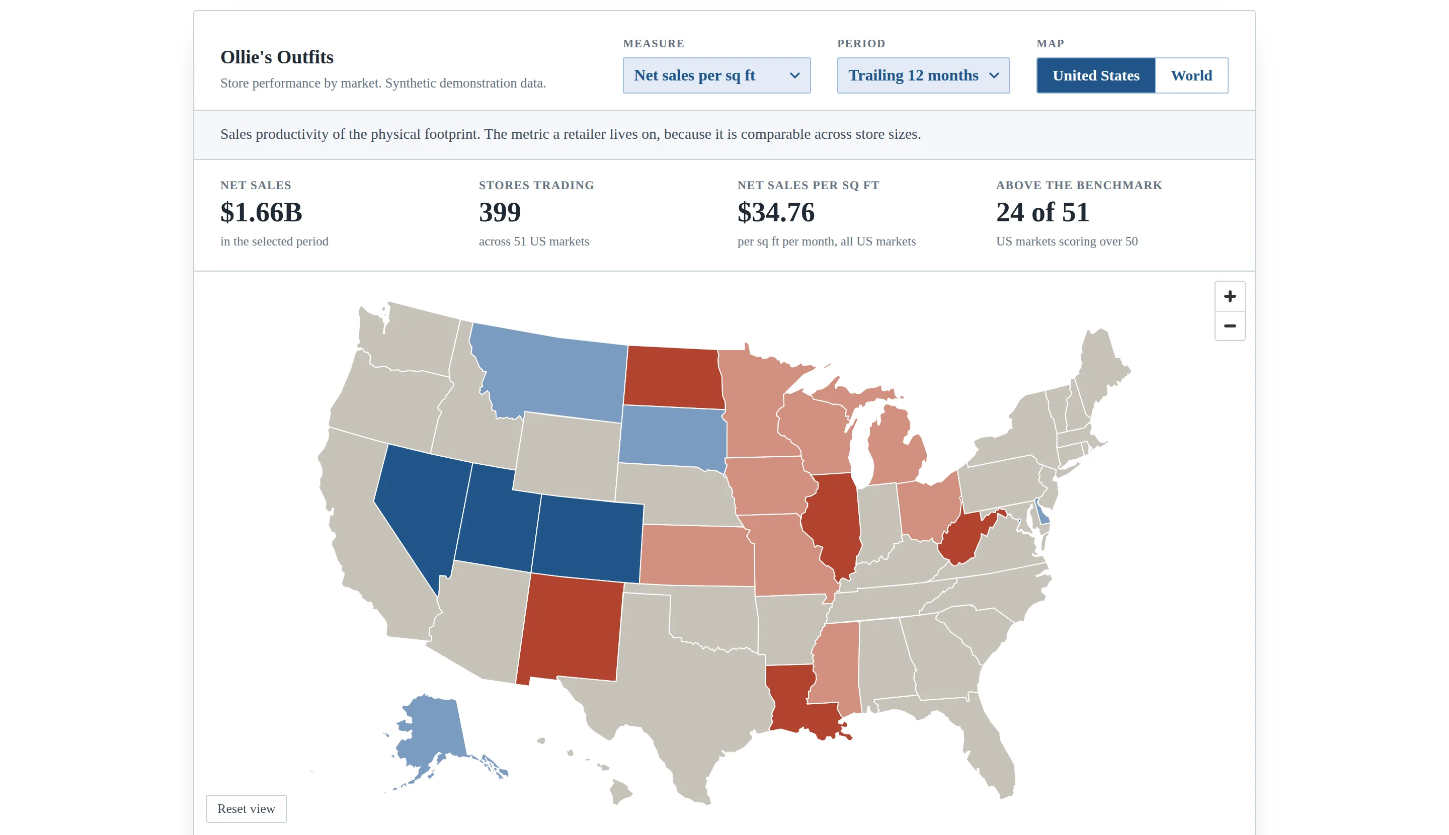
hover a state. the table lights up too

Where the money is, and where it is working live

A chain with 606 stores has a reporting problem, not a data problem. Total sales tells you where the stores are. It does not tell you whether a store is any good, and the two answers disagree more often than anyone expects. So nothing on this map is a total. Every measure is a rate, which is what makes a 6,000 foot store comparable to a 28,000 foot one.

Pick a measure, a time window and a store format and 51 US markets or 30 countries recolour. California turns out to be an ordinary performer carrying a lot of volume. Utah is the best market in the chain and would never surface on a sales report. The same dashboard is built in Excel too, filled map and all, in worksheet formulas that go back to Excel 2007.

7 measures · 5 windows · 140 views · built twice, in Excel and on the web

the limits get their own chapter

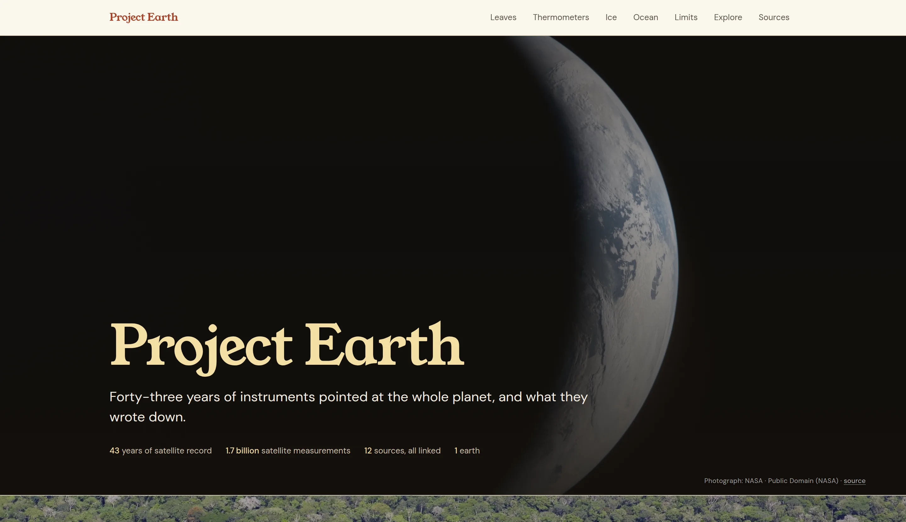
Project Earth interactive

A climate-data publication built from measured records for vegetation, temperature, carbon dioxide, sea ice, glaciers, ocean heat, sea level, rainfall, forest area, and fire. The story explains each metric before the explorer hands over the controls.

The hard part was not drawing the charts. It was making the records comparable, showing where satellite coverage is thin, and keeping an instrument change from becoming a flattering story about the planet. Every source is linked, every photograph is credited, and the limits stay in the main reading path.

43 years · 1.7 billion satellite measurements · 12 linked sources

load the sample. the planner does the rest

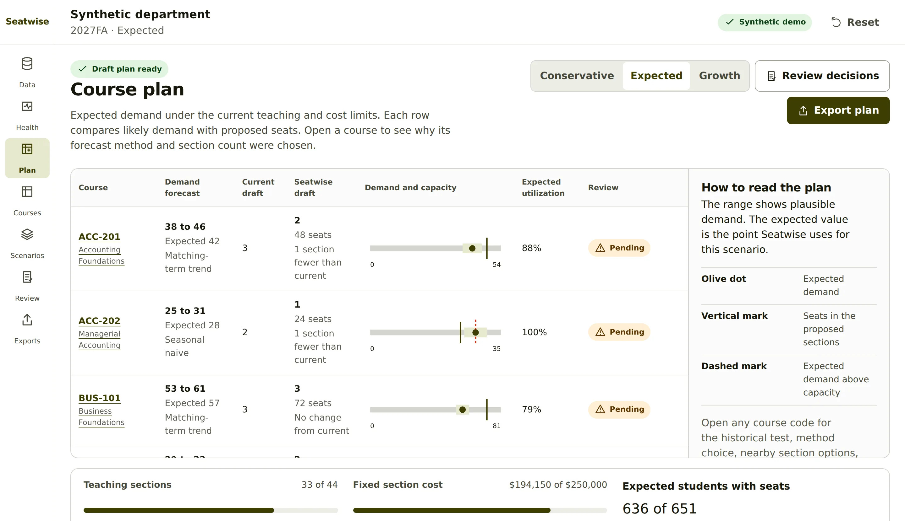
Seatwise demo

A course-demand and section-planning demo for small academic units. It checks four aggregate files, compares simple forecast methods against prior terms, estimates a planning range, and proposes whole-number sections under academic, teaching, and cost limits.

The public workflow uses a synthetic 24-course department. It keeps required-course access, uncertainty, human review, and reasoned overrides in view. There are no student records, institutional data, named instructors, accounts, or remote services.

24 synthetic courses · 12 terms · 5 forecast methods · 0 student records

more projects are in the queue. the shelf gets longer soon.

Writing

2026-08-03 · 4 min read

Why I built The Data Bulletin

The real number is public, free, and released on a schedule. Almost nobody at the table has seen it. So I built a site that puts claims next to official data, and learned to code properly along the way.

About me

I'm Micah McCaul. By day I'm a data analyst. By night I'm an analyst of data.

What I do best is solve problems. I've spent more than ten years working across different fields, and the work always comes down to the same thing: someone has a hard question, the information is a mess, and they need an answer they can act on and defend.

I like pipelines that check their own work, charts that link their sources, and plain-English explanations of both. Outside the day job I do photography, board games and touching grass.

Want a data person who ships?

micahjmccaul@gmail.com